Savings specialist invests in new identity
Sectors
- Bank and insurance
Know-how
- Identity / Branding
Situation & challenge
Creating a new dynamic
Garance, a historic player in the savings market for over 40 years, is suffering from a lack of brand awareness (ex-MNRA) and the arrival of new players on the market, more direct in their product approach and in their fully digitalized customer experience.
Faced with these tensions, Garance needs to evolve its positioning to retain its members and attract new targets.
Strategy
Reconciling mutual heritage and innovation
Sweet Punk chooses simplicity, proximity and transparency. Thanks to an identity that reconciles the brand’s mutualist heritage, a guarantee of transparency, with its pronounced taste for innovation and support, enabling easier access to savings.
Creative idea
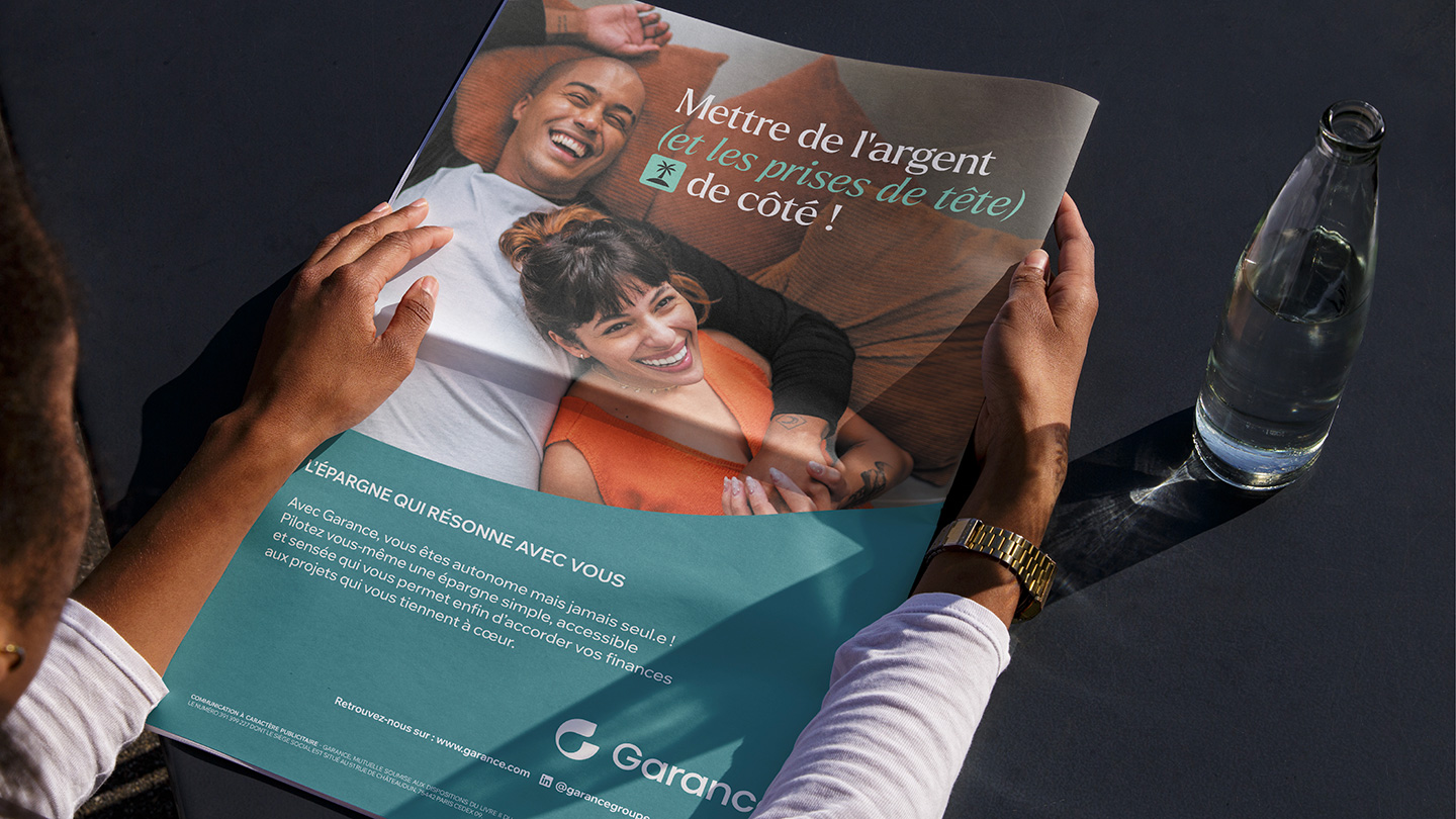
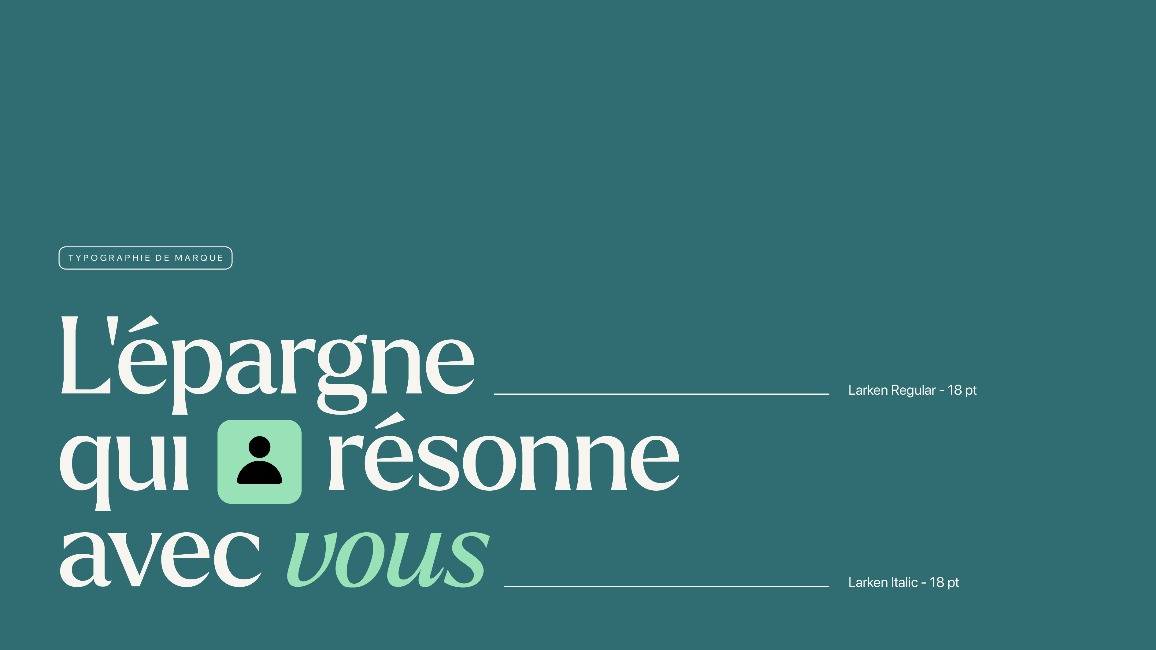
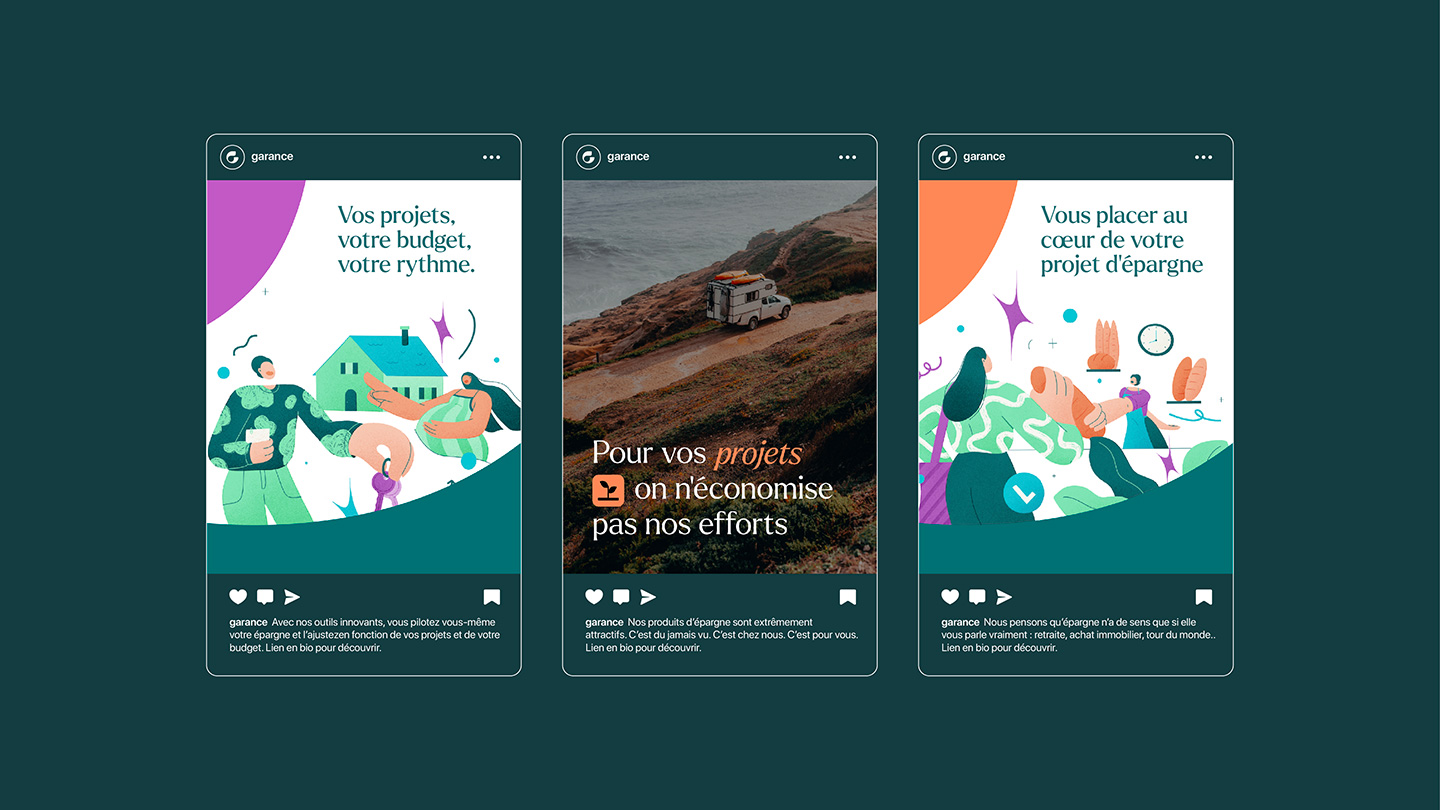
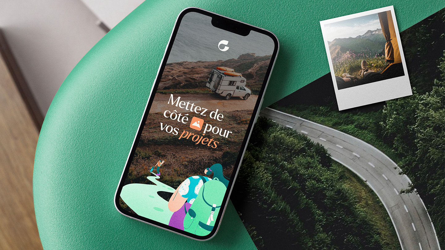
Garance, Savings that resonate with you
Sweet Punk has decided to play on a double meaning, particularly for its brand signature: that of well-considered, well-thought-out savings, built around the projects and objectives of each individual. It’s also about savings that vibrate in harmony with the saver, reflecting his or her projects and ambitions.
Resources strategy
Brand platform
The new brand platform aims to address the 4 major challenges facing Garance:
– reassurance, by defining mutualism and its values
– education, to change French people’s perception and knowledge of investment
– clarifying its offer and digitizing it, to win new market share
– differentiation, in a sector where both traditional players and new pure-play entrants are making their mark
Branding
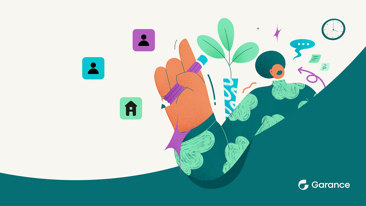
The new graphic identity reflects Garance’s attentive listening and its ambition to resonate with a wider target of active people:
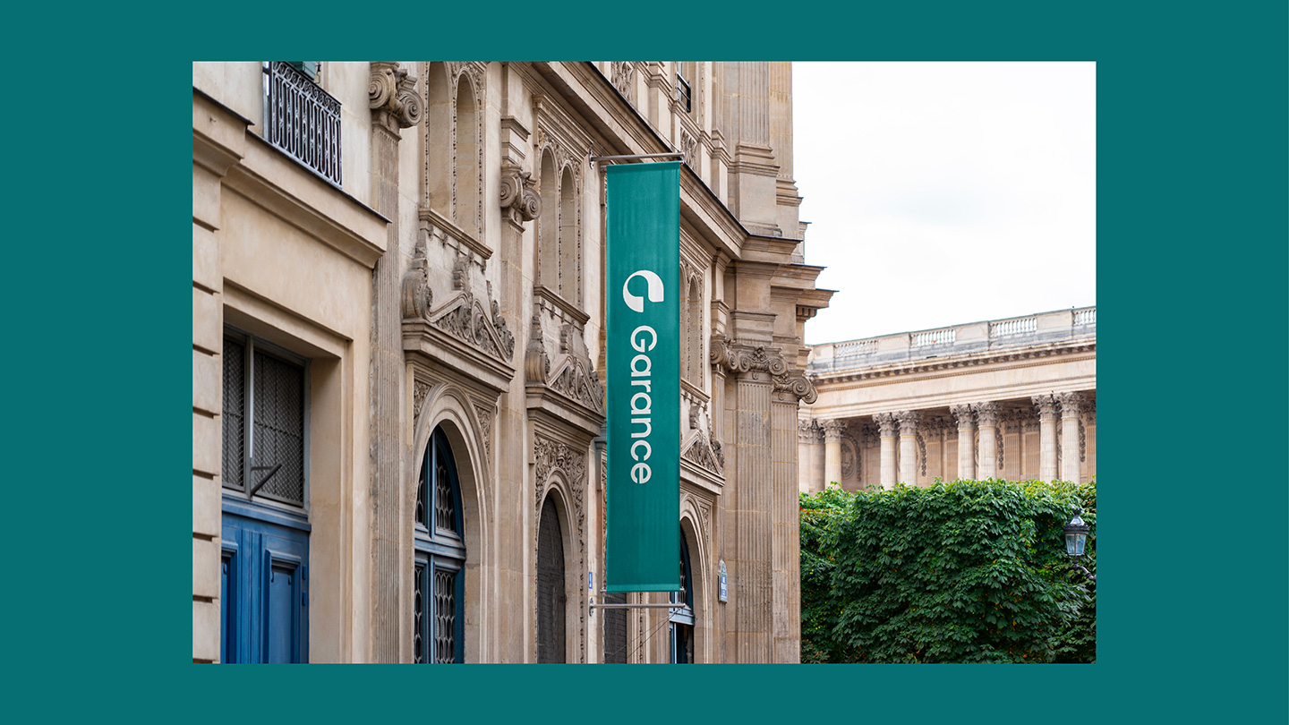
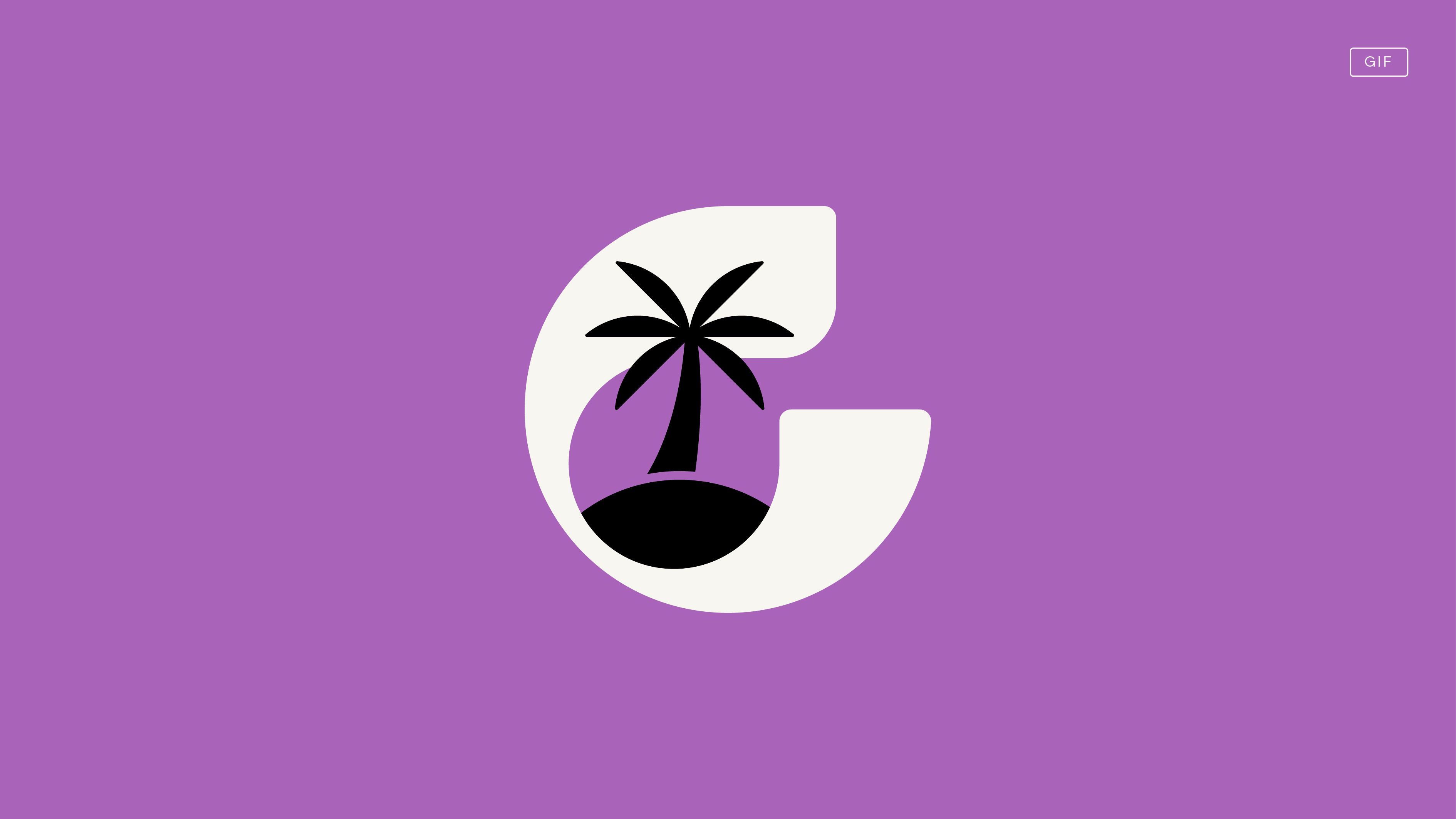
– The initial of the brand name indicates to its targets the path to follow to bring their projects to fruition. All in good hands, through its protective aspect.
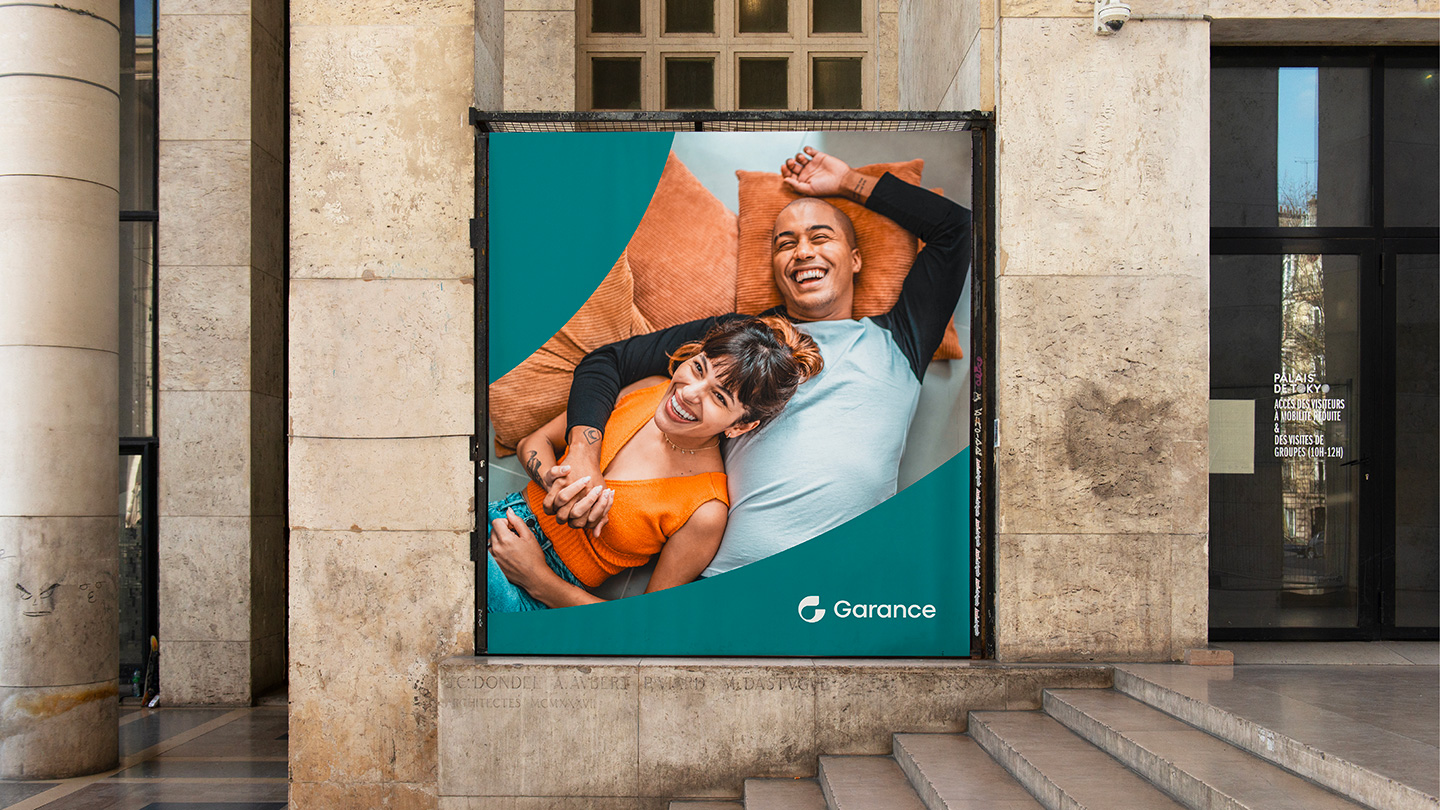
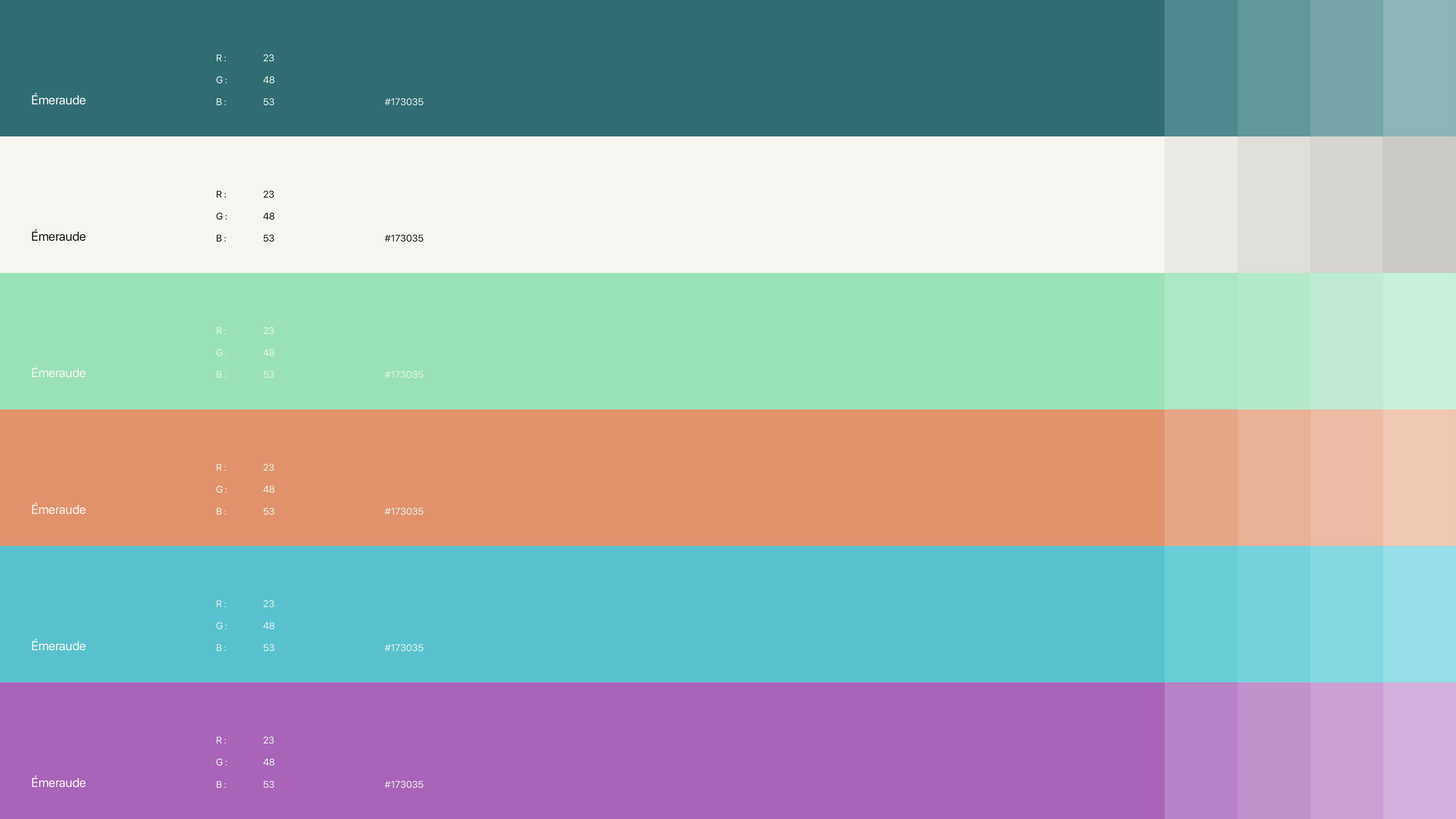
– Emerald green, the new identity color, positions the brand as a benchmark player in its sector, combining humility and modernity.
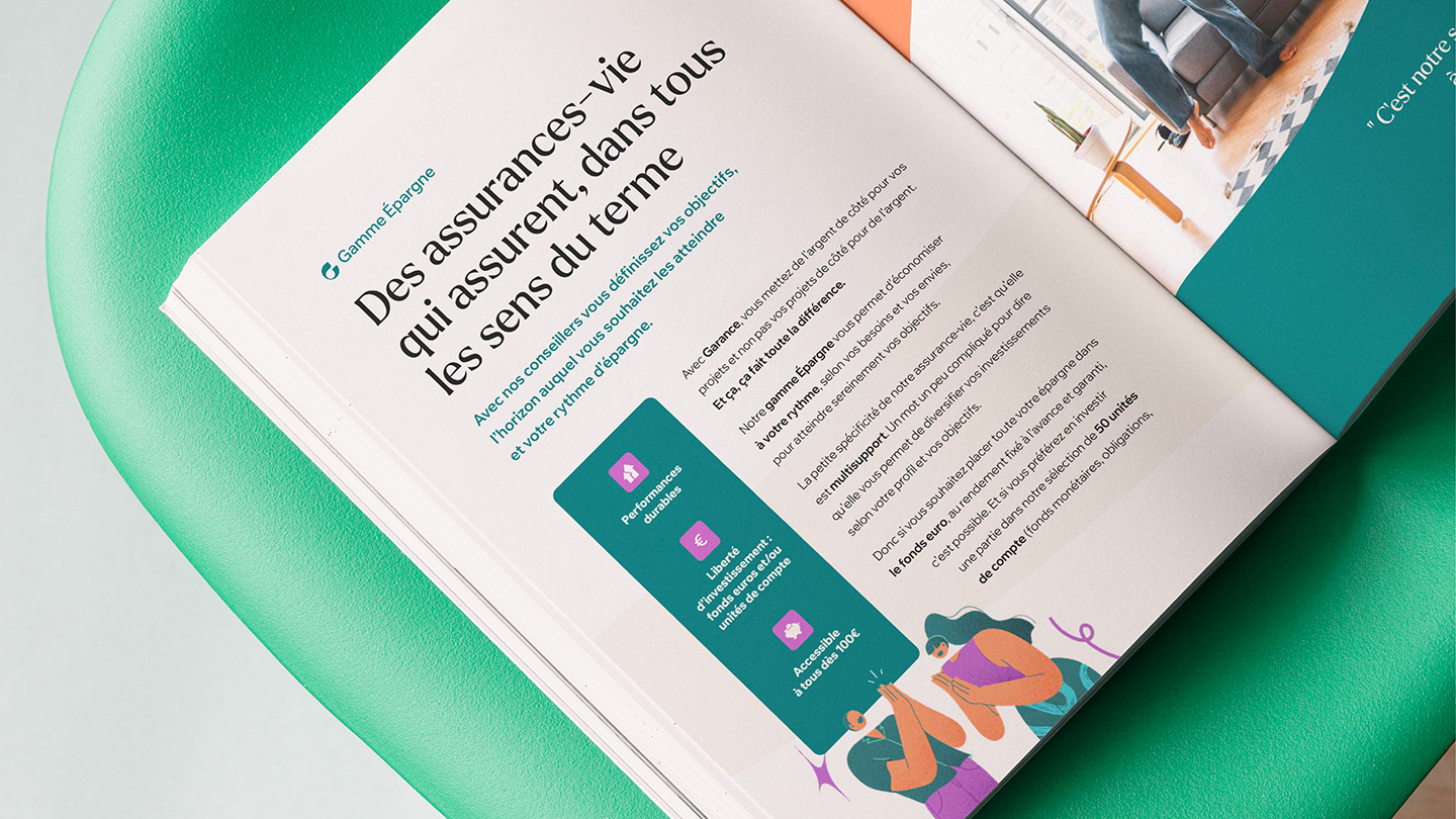
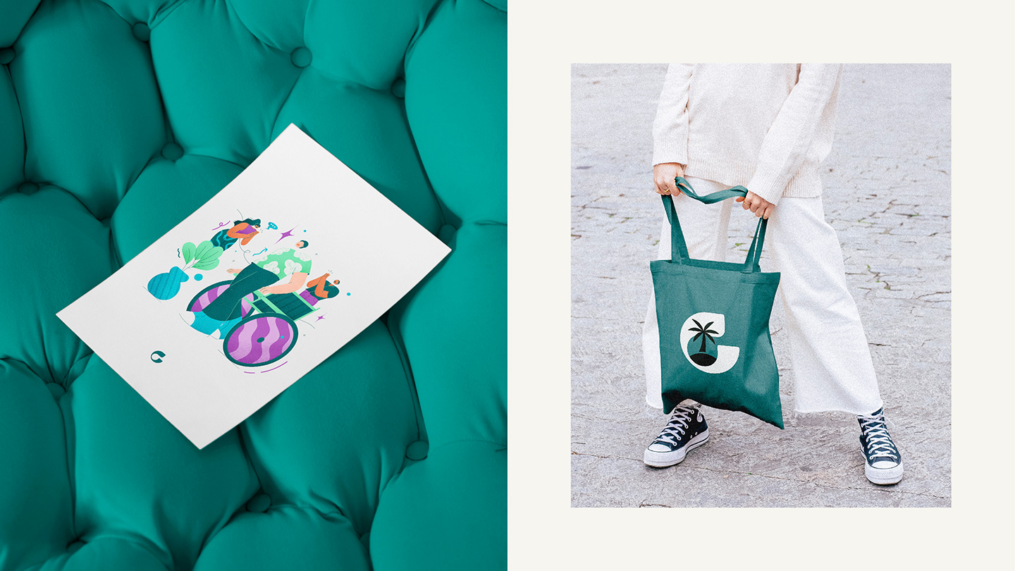
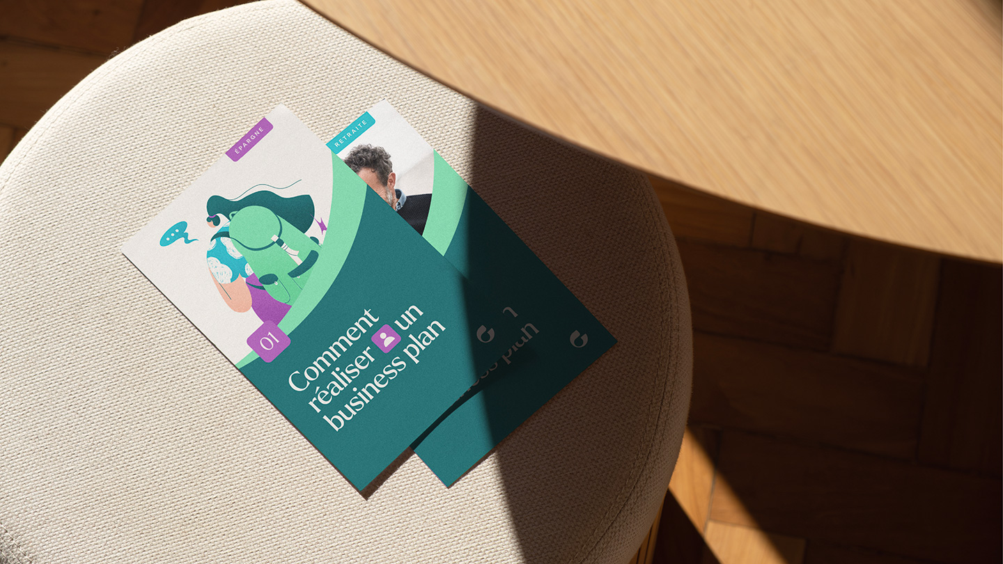
– A unique graphic system that symbolizes Garance’s commitment to helping its members realize their projects. This play of curves structures the group’s various statements, to welcome the brand’s different assets.
– A resolutely human iconography, a proprietary illustrative style and a brand-new color universe give the group vitality and modernity.
This new identity is becoming part of the everyday life of brand users, through a complete ecosystem, both physical and digital.
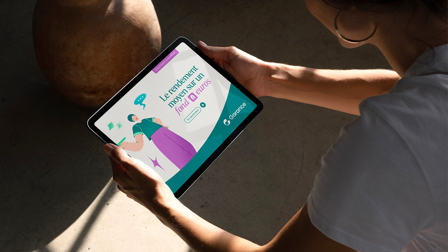
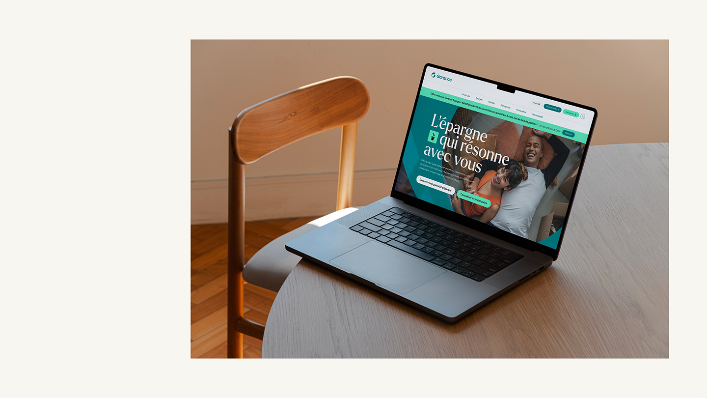
Website
In the same vein as the overhaul of the platform and identity, the site must be in phase with the desire to open up to new, younger and more digital targets.
The ambition is to make it a central touchpoint in Garance’s commercial development strategy, by integrating an online subscription path and, as always, the possibility of easily contacting an advisor for assistance with the process.
Garance, which makes support for its members a priority, has taken advantage of this opportunity to clarify its offers and propose educational content close to its target audience.
New identity


Digital applications
Print variations