A new identity for Europe's space future
Sectors
- Corporate
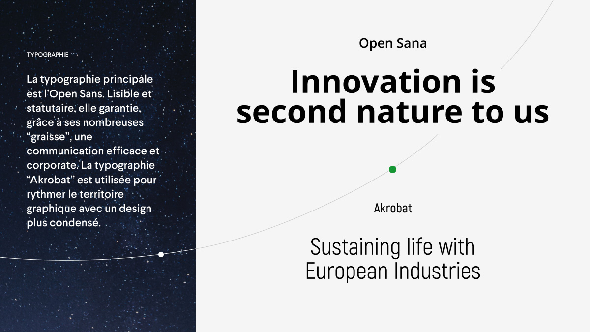
Know-how
- Brand strategy and advice
- Identity / Branding
- Website
MaiaSpace, a ticket to space and back
Situation & challenge
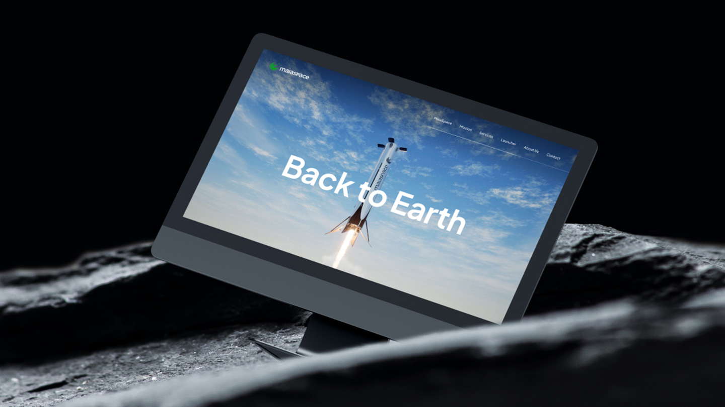
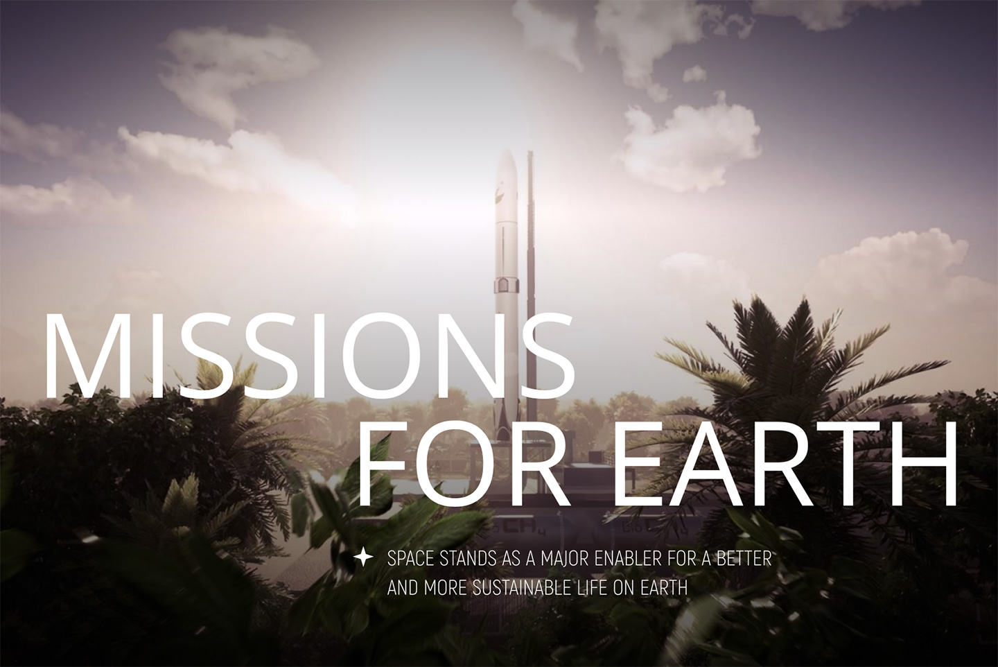
"Back to earth", it's not an SF movie
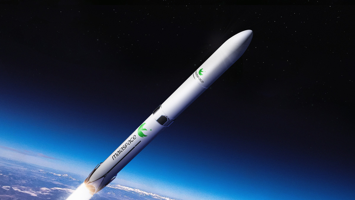
To compete with the international giants of the space sector, ArianeGroup has announced the creation of its new subsidiary MaiaSpace.
Its objective: to develop a reusable launcher, a first in Europe.
The name “maia space” was chosen to express consistency with the European launchers Ariane (a mythological character) and Vega (a star).
What’s more, Maia is the symbol of creation and fertility.
How do you create an identity that inspires both renewal and the promise of a responsible future for the space industry?
Strategy
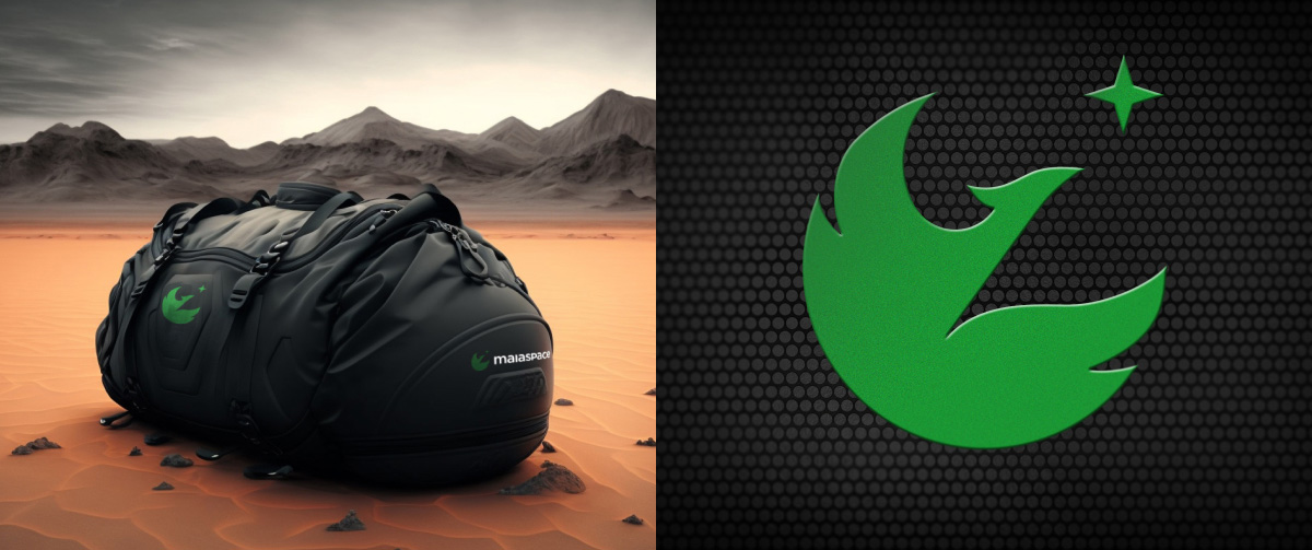
A symbol ready to become myth
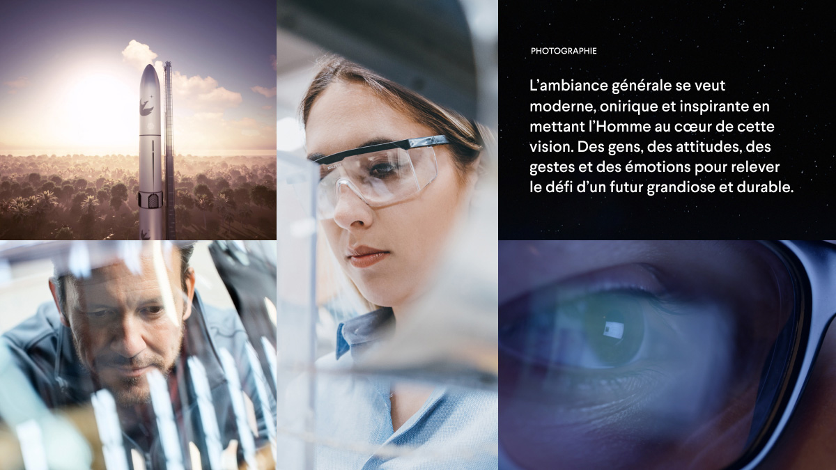
Since the brand has to appeal to the general public, we opted for an iconographic identity with a rich graphic semiology that everyone understands at first glance.
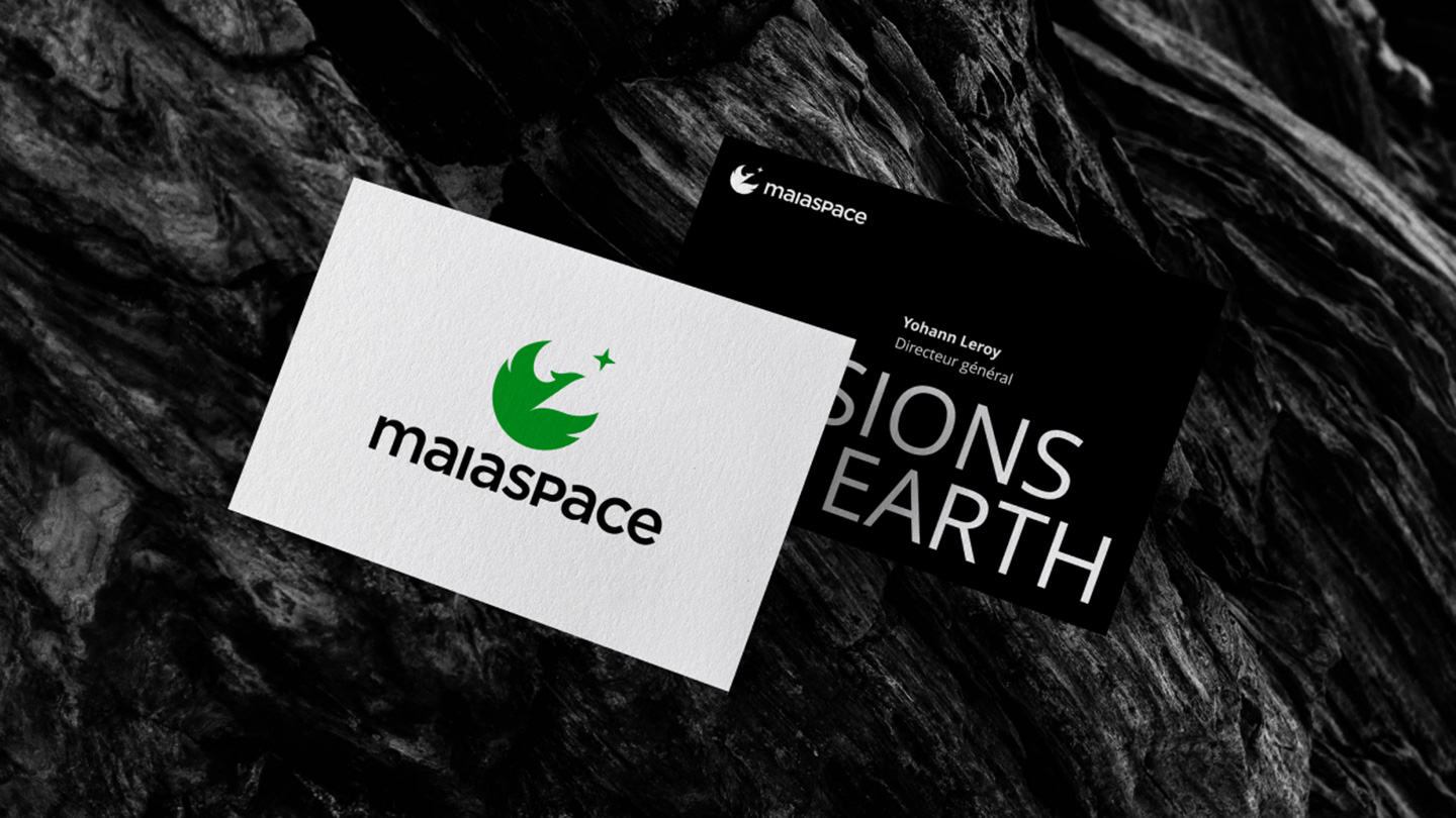
To make MaiaSpace a showcase for Europe’s space renaissance, while at the same time signifying its attachment to ArianeGroup, we kept certain identifying elements, such as the structure and typography of the group’s logo.
Creative idea
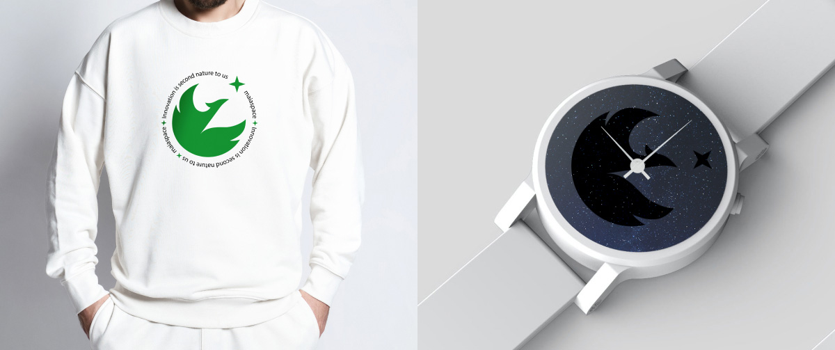
Rising from the ashes
The phoenix is a mythical firebird of extraordinary longevity, which at its death is consumed in flames only to be reborn from its ashes.
The starting point for MaiaSpace’s identity, it evokes something dreamlike, poetic and eternal, but also conveys an immense, almost divine force.
Associated with the space sector, the phoenix becomes the vessel that will carry Man and his dreams further and higher.
Ressources strategy
Branding
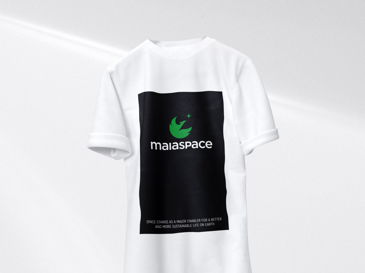
Definition of an identity embodying the brand’s values
- creation of a new logo
- creation of a new graphic and iconographic charter
Website
Creation of a website that embodies this renewal.
New graphic identity