An identity to the rhythm of its brand.
Sectors
- Culture and sport
- Corporate
Know-how
- Identity / Branding
The leader in musical events finds its harmony.
Situation & Challenge
Affirm your status
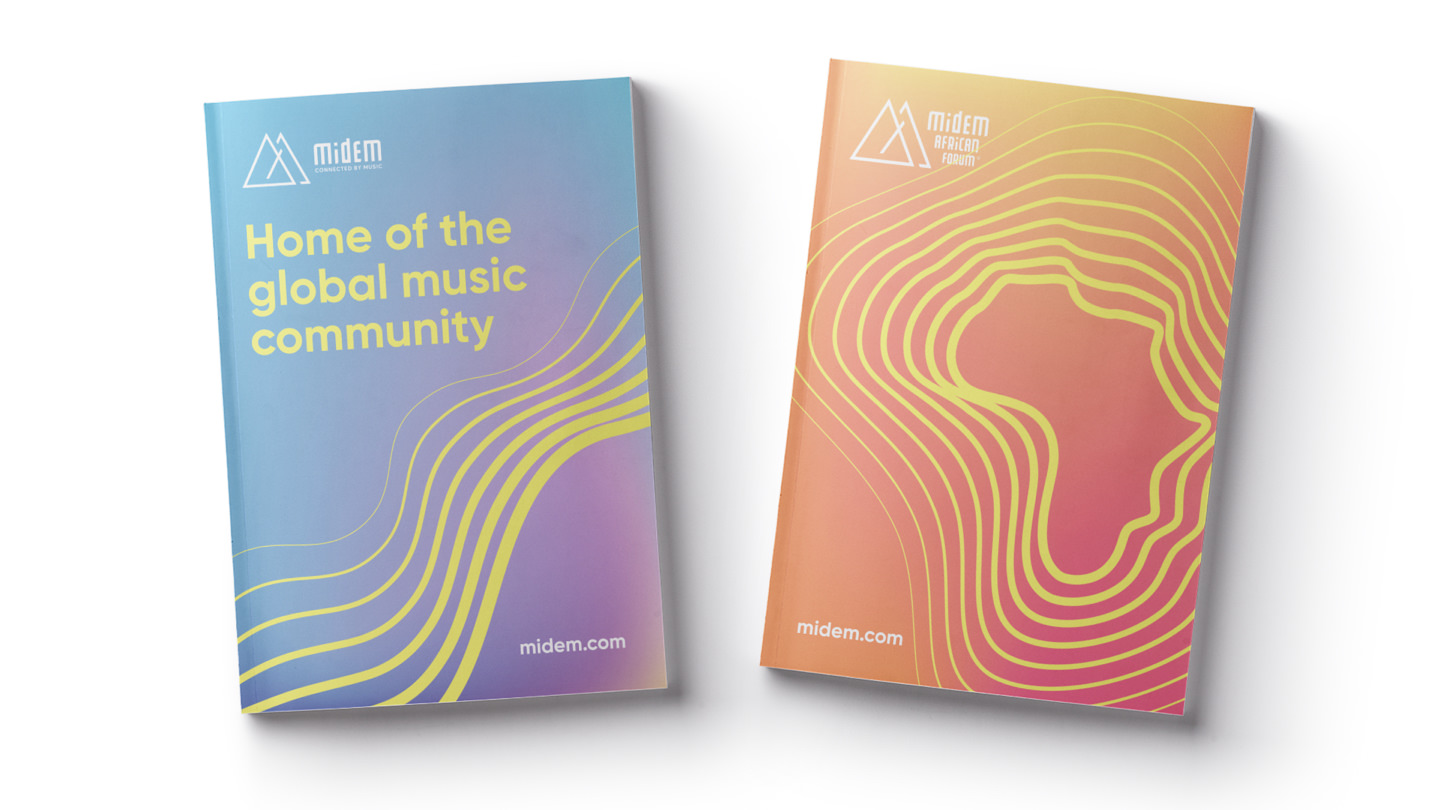
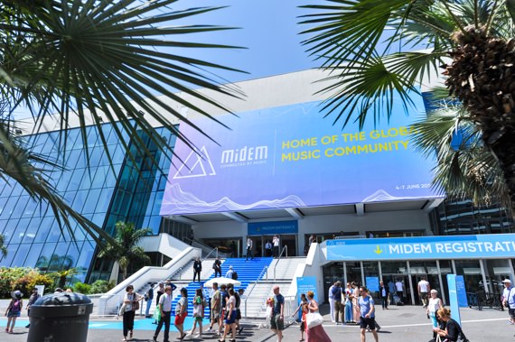
A major player in the music industry, Midem still suffers from an aging identity with no homogeneity. Sweet Punk was happy to support them in this upscale.
Strategy
The tempo according to Midem
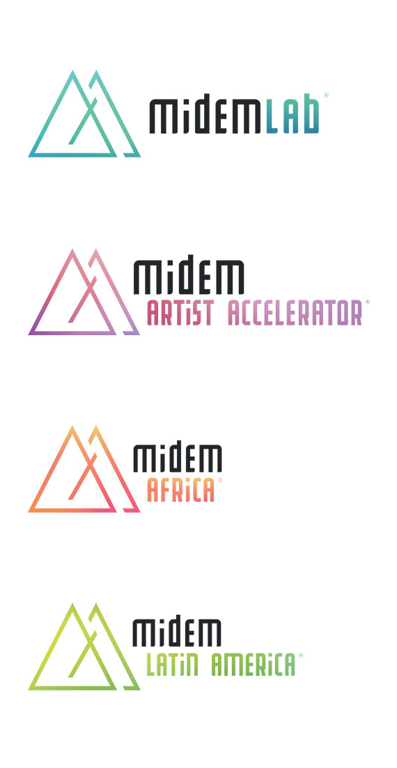
Sweet Punk relies on the maturity of the group to assert its leadership. We want to ensure consistency across the various programs offered by Midem. As the ultimate symbol of music, we place the group as the conductor of this sector in constant effervescence.
Creative Idea
To the rhythm of the metronome
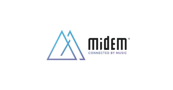
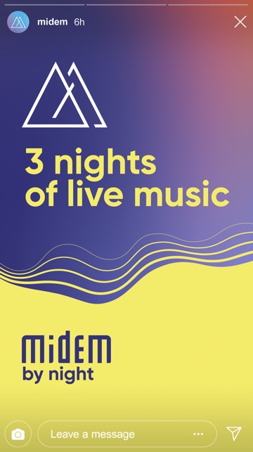
Music is above all a question of tempo! The logo is inspired by a metronome. By splitting it, the letter M is drawn to establish the maturity of Midem.
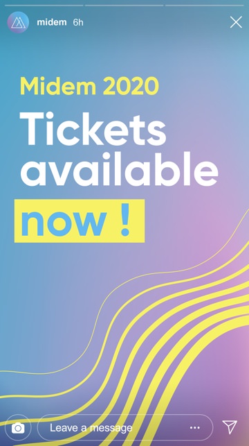
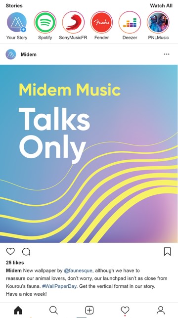
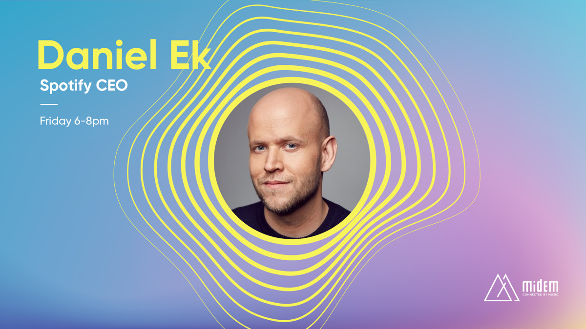
To enhance this new brand territory, we bring vibrancy and resonance to it. These sound waves carry a strong message to the eyes (and ears) of the spectator: Midem echoes the greatest musical successes.