Dark mode: a matter of substance?
Articles
Among the revolutions that accompanied the invention of the first Macintosh: the mouse, interactive windows, icons, there was a major change in the computer industry.
The beautiful typographies were displayed on the screen against an immaculate white background, in reference to the classic print. A principle that has become the norm, far from the fluorescent green characters drooling on the black screen of computers of the time. However, a general movement seems to shake up this large dose of white pixels, tiring our eyes all day long.
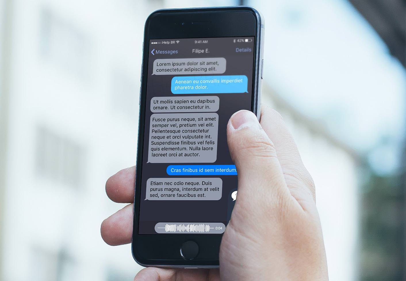
A real tidal wave. This is how we could describe the development of dark modes that is currently taking place in the world of interface design. Presented by Apple developers as THE great novelty of its new MacOS Mojave during the keynote of WWDC 2018, the dark mode or “dark mode” seems today to be emerging as a strong trend in interface design. Before Apple, it was Google and its international YouTube platform that had chosen the dark mode for the redesign of its new design. The American company continues to deploy the latter on all of these products and services.
An experience so contagious that it questions the deep nature of web design, the UX and UI rules and practices that result from it, but also their future and those of agencies and designers. So, will the world of web design inevitably switch to the dark side of the force?
From the shadow to the light
Lurking in the shadows for a few years, “dark modes” are now in the spotlight. From Google to Apple, via Twitter, or even Facebook, which recently announced the presence of a dark mode in the new version of its Messenger application planned for the beginning of next year, the dark mode is the head of displays new trends in web design. Microsoft, which has also indicated that it is working on the development and improvement of a dark mode for Windows 10, was one of the pioneers in the matter with its Windows Phone 7, which for the first time had a system operating system whose interface was mainly built on a black background.
This massive adoption of dark modes by a number of applications and operating systems is legitimately accompanied by promises and benefits for the user. In addition to improving reading comfort, dark mode significantly reduces eye strain because black has, according to several studies, been more relaxing for the eye in the long term. So handy for those who are used to reading long articles on their computers, tablets or mobiles. Another major benefit to the job is saving the battery on OLED screens. More generally, it is an energy saving that initiates the dark modes. And looking at it on a larger scale, it may well be that the democratization of the use of these modes can help save our planet.
Dark modes also have many advantages for amateurs and creative professionals who work every day in the detail of images, textures, video because these interfaces, in addition to highlighting the elements, give them the opportunity to focus on very meticulous tasks for a longer period of time. Creative software had understood this with their interface already built on dark bases.
A plunge into darkness
Feared by the majority of users, whose numerous studies reveal their preference for web content in light tones, dark shades are now in fashion, ready to reverse the balance of power in their favor. They appear to everyone as a recently discovered treasure that contains a thousand wonders.
The fear of this darkness in the background, web design owes it mainly to its heritage. A liability from which he suffered until then. A belief that dates back to the advent of the web and digital media. A time when paper support still dominated. Even though the issue of readability was significant, the printing of journals, books, magazines and other media mainly followed cost and logistical constraints. Since then, the Internet seems to have turned everything upside down. In appearance only. If digital does not meet the same constraints or the same rules as paper, the fact remains that it tends to extend its good old habits. Even though RGB offers us all creative freedom, black typography on a light background remains a deeply rooted standard.
Dark mode: the Ying and the Yang of web design
Does the adoption of dark modes mean the advent of a new paradigm in web design? It’s not all about looks or coolness. There are many parameters and factors to consider when it comes to determining what constitutes the first stage of design. The purpose of the interface, its readability and clarity, its content, its accessibility, its reactivity, its attractiveness.
With the democratization of dark modes, the consumption environment and the duration of exposure are data which seem to play more and more the role of regulator in terms of design. In this sense, the dark modes seem to open the way to a new era, a new mode of reflection in interface design. A certain rationalization of the space in which the interface is consumed for greater freedom and greater flexibility granted to the user. Whether he is exposed to bright sunlight under a tropical beach or confined to a dark place, his browsing and reading experience will never be affected.
When the habits of comfort are taken, the choices of UX and UI designer on the web could naturally lead to a dark atmosphere by default. It remains to be seen whether a switch will take place, leading to a mass adoption of the design on a black background. Nothing is less certain given the notion of positive neutrality that white carries. Yet the rationalization of the world, with the argument of saving energy (and our eye health) could push the pixel to rest, ie black, like the new universal logic. As is the blank white sheet of any intervention.
Share this article
Vous voulez en parler avec nous ?
Pourquoi ne pas se rencontrer pour échanger autour d’un projet ou d’une technologie ? Nous serions ravis de partager notre vision des choses !
Contact us