Logos out of stock.
Articles
The exercise of creating or redesigning your logo for a brand has always been perilous. Beyond the symbolism, issues of image and positioning, the first moments of exposure to the public are often synonymous with cold sweats.
We remember GAP and its new logo unanimously decried, rightly, forced to back off under pressure from Internet users.
Before pleasing the public, a sword of Damocles rises above the companies and creatives in charge of signing the new label. At the time of the last adjustments, the question will necessarily arise: “Is my logo original? Doesn’t my logo look like someone else’s? ” Because yes, with the various scandals or scathing remarks regularly accompanying the release of a logo, the risk that another designer had the same idea raises the thorny problem of plagiarism and its accusations heavy in consequences.
Not to mention the multinationals, the case remains frequent. However, it is very likely that the majority of designers and honest agencies respect the act of creation to some extent. After all, it’s their job. We must then explain why this happens to everyone at one time or another, to more or less painful degrees. This is what we will try to clarify for you, the reader, the internet user and the ruthless judge on the lookout for the next scandal.

A logo is a symbol, a design whose work tends towards minimalism. It is older than writing. Since hieroglyphics and antiquity millions of them have been born every year. All primary forms, symbolism, combinations, representations have been used and exhausted by entire generations. So try to create a logo whose symbol would be a bird. Your chances of being original are almost zero. A few years ago, a distant resemblance to the idea of ​​a creator several thousand kilometers from here or the logo of a local small business in the depths of Nevada would have gone unnoticed. Unfortunately, today there is Google image and its powerful engine that no longer misses a pixel on the web. The trend towards minimalism, flat, in recent years does not help. More and more logos are potentially alike. It’s a purely pragmatic, logical trend: By the time you read this article, nearly 1.5 million new images will be gobbled up on Google’s servers.
So there you go, you’ve just put your new site on air, the brand-new brand new logo is proudly on the front line. A twittos then comes to pin your newborn, going up the news that it looks like a distant and approximate competitor. The ensuing exchanges between creatives, customers and fervent third-party analysts are therefore rarely constructive. Before arriving there, it is possible to take precautions, to check in all countries of the world, with armies of jurists and image search engine running at full speed. This is what big brands and institutions do, but it doesn’t always work …
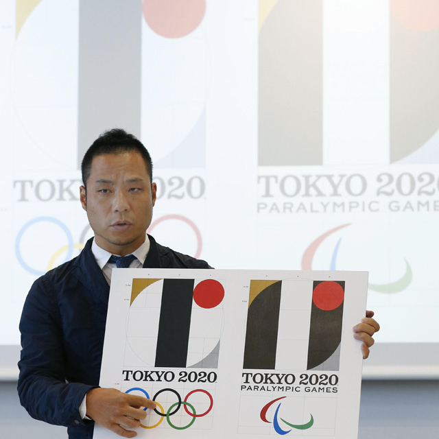
Take for example the infamous logo of the Tokyo 2020 Olympic Games. Kenjiro Sano, with all the art and honor specific to Japanese, has sworn not to have plagiarized the work of Olivier Debie, creator of the acronym of the Theatre of Liege in Belgium: “I have never been to Belgium, I have never seen this logo, I did not understand what was happening to me and I then experienced moments of worry.”
Let’s try a little psychology. A creative working on the next logo of the Olympic games is a professional a priori with the skills to deploy an approach and an honest reflection. Also, the graphic designer of the rising sun will surely have a small idea what awaits him if he decided in an access of cagnardise, to go to copy / paste an idea recovered on the net. After all, this is only the world sporting event visible to billions of humans. On a misunderstanding, it can pass … Let’s be serious, such an approach is almost impossible for those who have a hint of savvy.
Apart from this obvious argument, we can see that the forms used by the two graphic designers are pure, elementary forms. It is almost an academic “school” exercise, consisting of playing and juxtaposing squares, rounds and the like, smashing them in or out. It is with this minimalist purist approach that Mr. Sano set his own trap.
For me, creating the Tokyo 2020 logo was a dream, a chance in my career and I worked hard at it, explained Kenjiro Sano. [The two logos] are not alike because the thinking behind their design is totally different.
Too late, Mr. Sano, social networks are too fast, too sharp. The damage is done, you will never have authorship of your work again.
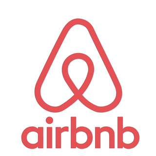
Other famous examples raise the same thunderbolts or questions. AirBnB or Beat have ultra-minimalist, pure, essential logos, as the trend wants. We remember the revelation of the new logo of the hosting site with this beautiful video in motion design explaining all the values and the process of creation to arrive at this elegant and engaging twist called: Le Bélo. Once again, the beauty of this approach was marred by the "discovery" of its twin in a book: "Trademarks & Symbols of the world: The Alphabet in Design" There are also double Beats, Flipboard or Medium .
There are too many references, too many liabilities, too many ideas and connected eyes to hope to automatically fall through the cracks on such a minimalist exercise. It’s kind of the same thing you teach young business people looking for the startup of the year: forget that you were the first to come up with the idea, that’s wrong. Others have had it. But make it yours and do it better than the others, authentically. This is the real approach.
So what should we remember or think about all this? If we put aside the legal aspect, often unstoppable and without mood, the main question to ask is whether the logo created corresponds to the values of the company, to the image it wants transmit. Is the approach sincere? Were the creative exchanges constructive? Is the mission fulfilled? Will your customers and your community recognize you through this little symbol that wants to become big? If yes, then you’ve probably done a good job. At worst there remains the solution to hide behind the famous quote from Picasso taken up by Steve Jobs: “Good artists copy, great artists steal.”
Share this article
Vous voulez en parler avec nous ?
Pourquoi ne pas se rencontrer pour échanger autour d’un projet ou d’une technologie ? Nous serions ravis de partager notre vision des choses !
Contact us