Everyone against cancer makes a difference
Sectors
- Associative / environment
Know-how
- Identity / Branding
The cancer association strengthens its identity platform
Situation & challenge
Strengthening the TLMC collective
When someone is ill, the whole family is affected. This is the vision of Tout le monde contre le Cancer, an association that has been working since 2005 to bring joy back into the daily lives of sufferers and those around them, to give them the strength to move forward.
After more than 19 years in existence, it was time for the association to realign its convictions, its discourse and its graphic identity to gain in coherence and strengthen its position with its various target audiences.
Strategy
Gathering the happy team around the same story
Because the association’s long-term survival and actions depend on the generosity of its volunteers and donors, it was crucial to project a credible and distinctive image.
The starting point for our strategic response was to more accurately reflect the association’s reality, and to make the pillars of its identity more salient.
The objective: to consolidate the brand and its message, by means of a more structured identity platform, an editorial charter, a logo and a more assertive graphic territory.
Creative idea
TLMC troublemakers shake up the association's identity
Team spirit, joy and mischief are central to the association’s DNA, and form the basis of the new identity. The aim was not only to assert a proprietary graphic signature, but also to counteract the usually miserabilistic discourse.
We therefore designed a range of illustrative mascots, which can be adapted to suit a variety of situations, symbolizing the caregiver-patient-caregiver team that is so central to the association’s vision.
This playful concept humanizes the brand’s message and celebrates the association’s mantra “as long as there’s joy, there’s life” throughout the graphic universe.
Our guidance
Consulting and branding
– Definition of a new brand platform
– Communication positioning and brand territory
Identity
– Design of graphic assets
– Drafting of the new editorial charter
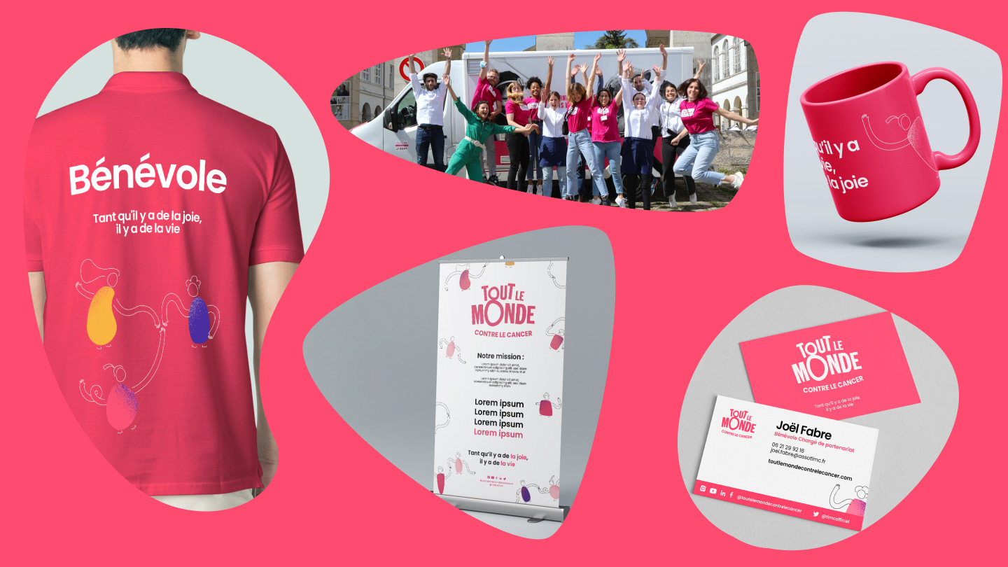
– Implementation on print media and goodies
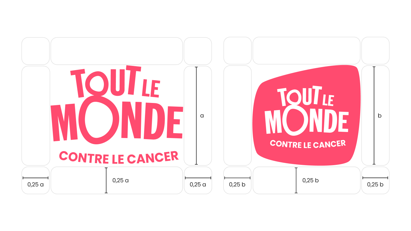
Logotype
The design of the logotype is unique and made up of several inseparable elements whose positions/proportions cannot be adjusted.
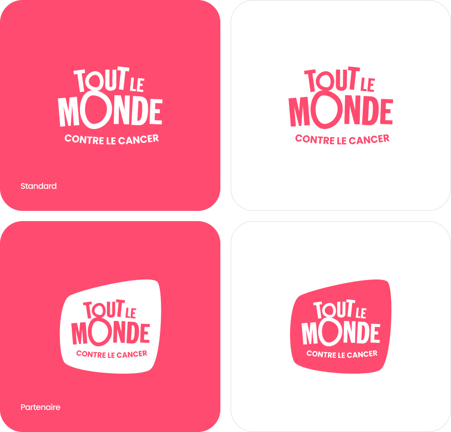
Declinations
There are two main versions of the logo to maintain a good level of legibility. A standard logo and a partner logo.
Baseline
A baseline that expresses the will, commitment and actions of Tout le Monde Contre le Cancer on a daily basis.
On communication media, it complements the logotype, but can also stand alone depending on the medium (e.g. mugs, pencils, stickers, etc.).

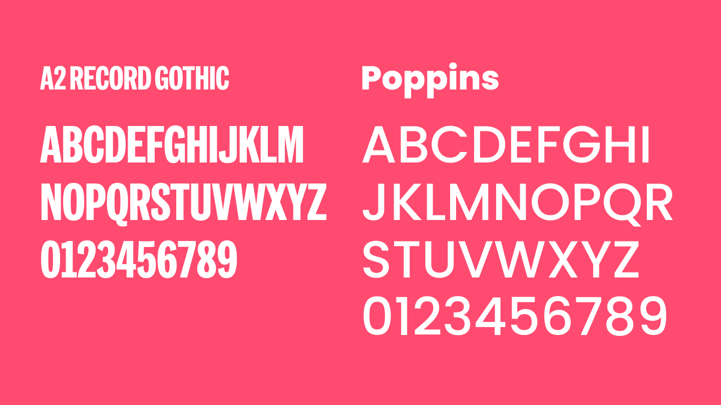
Typographies
The A2 Record Gothic evokes professionalism and rigor.
Clear and legible, the Poppins is sober. It gives free rein to the expression of strong, impactful and encouraging messages.
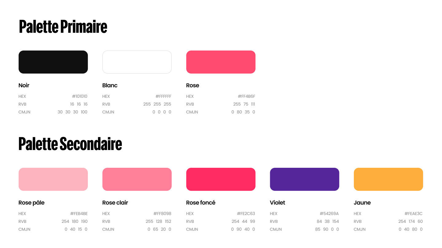
The color palette
Goodies and other declinations